When Art Meets Design: Signac's Anarchist Interiors
Miguel Fernández ·
Listen to this article~3 min
Explore how Paul Signac's anarchist paintings and Henry Havard's design guides used the same scientific principles of color and line, revealing a surprising link between art and consumerism.
Let's talk about something fascinating that doesn't come up often over coffee. It's about how two completely different worlds—art and interior design—ended up speaking the same visual language in late 19th-century France. I'm looking at Paul Signac's paintings of bourgeois rooms and Henry Havard's popular design guides. On the surface, they couldn't be more different.
Signac was a Neo-Impressionist painter with strong anarchist beliefs. He saw his art as part of a social revolution. Havard, on the other hand, wrote manuals for the rising consumer class, telling people how to furnish their homes properly. One wanted to tear down the system; the other was helping people decorate within it. Yet here's the twist—they were using the same rulebook.
### The Shared Visual Language
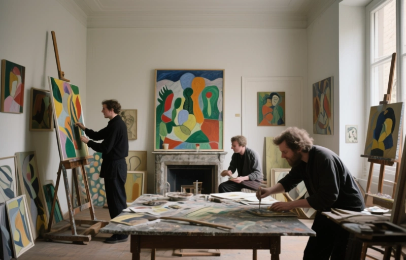
Both Signac in his paintings and Havard in his advice were obsessed with scientific principles. They believed color and line could directly influence psychology and emotion. In Signac's works *Salle à manger* (1886–1887) and *Un Dimanche* (1888–1890), every furniture placement feels calculated. The same goes for Havard's books like *L'Art dans la maison* (1884).
They weren't just throwing pretty things together. They were applying theories about harmony, balance, and emotional effect. Think of it like a recipe where both a rebel chef and a corporate caterer use the exact same ingredients from the same supplier. The intended meal might be different, but the foundational components are identical.
### Where Ideologies Collide and Connect
Signac's anarchism rejected bourgeois values, yet he painted bourgeois interiors. Havard's writing supported industrial growth and consumerism. Their end goals were poles apart. But their method? Strikingly similar. They both had this unwavering faith that science—especially color theory and optics—could create a better, more harmonious environment.
It shows up in a few key areas:
- The deliberate choice of furniture to guide movement and mood in a room
- The strategic arrangement of objects to create visual balance
- Most importantly, the use of specific color combinations and lines to produce psychological effects
You can almost imagine them reading the same dense, scientific texts by theorists like Charles Henry, then going off to do completely different things with the information. One to critique a society, the other to help build its domestic spaces.
### The Confidence in Progress
That shared confidence is what really links them. In a time of rapid change, both the anarchist artist and the commercial design writer looked to science as the ultimate guide for progress. It's a reminder that sometimes the tools we use are neutral. It's our intention that gives them meaning.
So what can we take from this? Maybe that opposing ideas aren't always built from different materials. Sometimes, the most divergent paths start from the same point on the map. The next time you look at a painting or think about rearranging your furniture, remember there's a whole history of thought behind those choices. And sometimes, that history has some strange bedfellows.