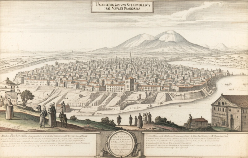
Unlocking Jan van Stinemolen's 1582 Naples Panorama
Miguel Fernández ·
Listen to this article~4 min
Discover how new research reveals Jan van Stinemolen's 1582 'Panorama of Naples' as a complex artistic construction, not a simple snapshot. A collaborative project used digitized maps to decode its secrets.
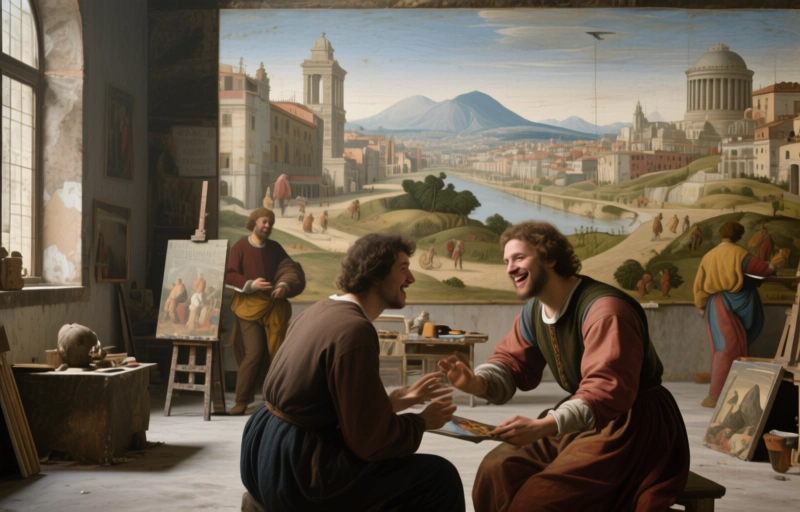
If you're like me, you've probably seen old maps and drawings and thought they were just simple records of a place. A snapshot in time, right? Well, that's what I thought too, until I dug into Jan van Stinemolen's *Panorama of Naples* from 1582. This isn't just a drawing. It's a complex, layered masterpiece that tells a story far deeper than its surface reveals.
A recent collaborative research project set out with two clear goals. First, to identify as many of the actual sites and landmarks depicted in this massive drawing as possible. Second, and perhaps more fascinating, was to investigate how Stinemolen put it all together. How did he compose it artistically? What techniques did he use? The findings completely changed how we see this work.
### The Collaborative Research Journey
This wasn't a solo effort. Scholars came together, pooling resources and expertise to tackle Stinemolen's monumental vision. They didn't just look at the drawing in isolation. A key part of their approach involved diving into digitized historical maps from the Bibliotheca Hertziana – Max Planck Institute for Art History. These annotated maps were absolutely fundamental. They acted like a Rosetta Stone, helping the team cross-reference the artistic rendering with the geographical and architectural reality of 16th-century Naples.
Think of it like detective work. You have the suspect's sketch (the panorama), and you need to match it to crime scene photos (the historical maps and records). Each identified building, street, or hill wasn't just a checkmark. It was a clue to understanding Stinemolen's intent and method.
### More Than a Simple Snapshot
Here's the real kicker. The investigation into the drawing's artistic composition and what experts call its "intermedial construction" revealed something crucial. This panorama is far from a straightforward, realistic depiction. Stinemolen wasn't just copying what he saw. He was interpreting, composing, and constructing a narrative.
- **Artistic License:** He likely manipulated perspectives to fit more of the city into the frame or to emphasize certain structures.
- **Symbolic Layering:** Buildings might be sized or placed for symbolic importance, not just physical accuracy.
- **A Mediated View:** The work sits between a map, a portrait of a city, and a piece of artistic expression. It's a blend of media and purpose.
This revelation is huge. It means we can't look at this as a simple historical photograph. We have to read it as a crafted document, full of choices made by the artist. It tells us not only *what* Naples looked like, but *how* a skilled draftsman chose to present it to his audience. What did he want them to see? What story was he trying to tell about this powerful city in 1582?
As one researcher noted, "The panorama is a conversation between accuracy and artistry, and we're just now learning to hear both voices."
### Why This Matters for Professionals
So, why should this matter to you, especially if you're working in fields related to art history, cartography, or cultural heritage? This project is a blueprint for modern interdisciplinary research. It shows the power of combining:
- Traditional art historical analysis
- Digital humanities tools (like those digitized maps)
- Collaborative, goal-oriented projects
It proves that even well-known works can yield new secrets when we ask new questions and use new methods. The essential bibliography that came out of this project isn't just a reading list. It's a map of the intellectual journey itself, pointing to the interpretations and resources that made these discoveries possible. It's an invitation to continue the conversation and look deeper at the works we think we already understand.