When Art Meets Design: Signac, Anarchism & Bourgeois…
Miguel Fernández ·
Listen to this article~3 min
Explore the surprising link between Paul Signac's anarchist paintings and Henry Havard's bourgeois design guides. Discover how color, line, and a faith in science connected two opposing worlds.
Let's talk about something that seems like a total contradiction. On one hand, you have Paul Signac, a Neo-Impressionist painter whose work was steeped in anarchist ideology. On the other, you have Henry Havard, an interior design guru writing manuals for the rising bourgeois consumer class. They should be worlds apart, right?
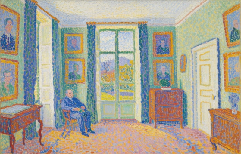
But here's the fascinating twist. When you look at Signac's paintings of domestic spaces—like *Salle à manger* (1886–1887) and *Un Dimanche* (1888–1890)—and then read Havard's design books from the same period, something unexpected happens. You start to see the same ideas popping up in both places.
### The Unlikely Common Ground
It's all about the science of seeing and feeling. Both Signac and Havard were obsessed with how color and line worked on a person's mind. Signac used his pointillist technique, those tiny dots of pure color, to create harmony and emotion. He believed art could change society, and his methods were a form of visual anarchism.
Havard, meanwhile, was writing the rulebooks for the stylish home. His works, *L'Art dans la maison* (1884) and *La Décoration* (1892), told the new middle class exactly how to arrange their furniture and choose their wall colors. His goal was to sell a lifestyle, to fuel the new consumer economy.
So one guy wanted to tear down the system, and the other was helping to build its living rooms. Yet, they were reading from the same playbook when it came to the fundamentals.
### The Shared Language of Color and Form
Where this connection really shines is in the details. Look at how both approached a room:
- **Furniture Arrangement:** Both emphasized balance and purpose. A chair wasn't just a chair; its placement directed movement and interaction.
- **Color Application:** This is where it gets psychological. They both treated color as a tool to influence mood and perception, not just decoration.
- **Use of Line:** Straight lines for order, curves for comfort. The underlying geometry of a space mattered deeply to both the painter and the designer.
It's like they both believed you could engineer a better experience, whether it was on a canvas or in a 12-foot by 15-foot parlor. They shared a deep, almost unwavering faith that science—optics, psychology, color theory—held the key to progress.
As one critic of the era might have mused, "The palette and the parlour are both laboratories for the modern soul."
That shared confidence in progress through science is what ultimately bridged their wildly divergent ideologies. It's a reminder that sometimes, the tools we use to build our dreams—or critique our world—can come from the same source. The next time you feel a certain way in a beautifully designed room, or get lost in a painting's atmosphere, you might be feeling the echoes of that late-19th century debate, where art and commerce found a strange, common language.